IronViz 2020

Did you see IronViz 2020 has been announced?

I love participating in IronViz, though I’ve realised some things are more important to me. Continuing to see diversity among the talented people who represent the community on the IronViz stage is super important, as is connecting with and helping those in the community aiming to get on the stage.

Many of the talented people in our community who represent minority groups do not ask anything more than their voice amplifying. Building connections and amplifying diverse voices is key, we all need to do that. I also realise that there will be some in the community who, for many reasons, haven’t been able to build connections to get help, or are ignored when they ask for it. We need to acknowledge our community is biased, particularly towards westerners, and people may need alternative routes to get help.

To that end I’m not going to participate in the IronViz competition and instead I offer the time I would have spent competing to advise and help those in the Tableau community who feel under-represented. I’d also love to make better friends and connections along the way – so feel free to book a session to simply connect over IronViz. I won’t ask people who use my time to justify using it; I assume there are many hidden reasons people would feel under-represented, well beyond gender and race that gets discussed most often.

Use this link to book time with me, I hope I have enough slots to cover different time zones and ensure fair representation – but please feedback if that isn’t the case.

Mark Bradbourne has also offered his time use this link to book time with him.

Analytical Maturity in your Organisation: Is it Important?

On Monday 16th February 2020 our weekly Twitter chat #datadump discussed Analytical Maturity. This write up is a write-up of the session condensed into a blog post and is a product of many of the opinions offered by those participating in the chat.

NB. this is a temporary home while a site is built to house these posts in future.

Defining Analytics Maturity

With several models published online it can be hard to even work out what a definition of Analytical Maturity should be. At its simplest level analytics can be thought of as a continuum starting at simple reporting of what happened, when, where and why and moving through to complex forecasting of what will happen, when and why, and automating decisions based from that, e.g. Next Best Action, or Recommendations.

Two examples of maturity curves found online:

Image
https://www.kdnuggets.com/2019/03/four-levels-analytics-maturity.html
https://www.arbelatech.com/insights/blog/what-is-the-business-intelligence-analytics-maturity-model.html

Clearly though each definition needs tailoring for your organisation and many organisations see success in taking published models and doing just this, sometimes amending them for individual functions. This can make it easier to ensure as roadmaps for analytics are built that they align closely with the sponsors in those areas.

How do Organisations use Analytics Maturity Models?

Assessing where a functional area currently sits on the curve can be difficult though, and so key criteria and KPIs (both financial and non-financial) should be used to assess and measure the impact of analytical use-cases.

From there normally a maturity curve is used for assessing an organisation’s or functional area’s current state, vs some future state, e.g. perhaps to justify strategic / funding decisions around people, processes or tools. Teams driving these initiatives should be wary of “boiling the ocean” though, instead using them to help prioritisation and delivery of projects.

The example below was shared by Fi Gordon (@VizChic) as an example of JLL’s maturity curve:

One criticism of maturity curves is that they are sometimes seen as a sales tool, with vendors using the hype around the higher end of the scale to push their own agenda, and drive an agenda that may not provide sustainable in the long term.

To this end it’s important not to see different ends of the scale as good and bad. Instead organisations need use maturity models as conversations starters across the business to see what value might be derived from certain activities, and then assess the investment, in people, processes and tools, to decide whether the value should be realised.

Another important point is that the curve is almost always a progression, building blocks on which to progress through an analytical journey. Each level in the journey requires a degree of understanding from stakeholders, technical teams and the business, attempting to shortcut the journey by throwing money and skipping parts of the journey will almost always result in failure.

Structuring Data Teams for Analytical Maturity

It can be tempting to scale out BI existing teams, either in the business or in central BI teams, and ask them to take on more of the predictive and other data science type tasks as the need arises, allowing teams to establish skills and demand to grow naturally. There are dangers in this approach though, especially as BI gets less technical and moves more into data visualisation specialism, in that teams can be ill-equipped skills-wise to move into a different skill-set. Often predictive and prescriptive data analysis needs more code based skills and a more mathematical / statistical understanding.

This organic growth risks modelling functions growing on an adhoc basis, and lacking the skills, support and infrastructure needed to properly do their job.

There is value in allowing teams establishing an deep, rich and rigorous exploration of the depths of their disciplines, as explained in this excellent article: https://hbr.org/2018/12/what-great-data-analysts-do-and-why-every-organization-needs-them. Allowing single discipline teams to focus on BI, and growing separate modelling / data science can therefore seem an attractive option that allows teams to grow their own identities separately..

This approach though can lead to perceived hierarchies internally, and the need to build close working relationships between teams should not be underestimated if they are to function as a group. Reporting teams should not be seen as “less mature” but instead should be seen as having skills in data visualisation, education and communication. Data Science shouldn’t attempt to deliver reporting, in the same way as the reporting team shouldn’t deliver models. Teams instead should come together to build and deliver products using their skill-sets, with modelling supported by descriptive and exploratory analysis allowing the business to make effective decisions.

What Next?

Clearly growing an analytics function in a business is a complex task, but some basic elements help build a strong foundation.

Data Literacy is one pillar to build on, helping equip both the users of data in the business, and the developers of reports and models, with a shared understanding of data is key. Secondly automation is a second pillar that can help remove time consuming activities, to free time for more complex analysis, and also helps give a business a shared understanding of the issues around maturing analytics further.

Further Reading

The questions and threads from this weeks #datadump, and the answers from those participating, that formed the basis for this blog, can be found below. Thanks again to all those whose opinions and words helped write this blog.

IronViz Blues

Feeling down today? You got your IronViz email yesterday and, while you didn’t expect to win, if you’re honest you’re a bit pissed off with your scores.

You poured days and weeks into your visualisation and you’re now wondering why you bothered. The scores you got are disappointing and you look at the Top 10 and feel like it’s going to be impossible to predict what the judges will like. You had a handful of views on @tableaupublic but let’s face it your viz got lost in the noise. The next feeder starts in a week’s time and honestly you can’t be bothered to put in all that effort all over again.

You’re not alone. 90% of people didn’t make the Top 10. If they’re human most will be wondering why they bothered.

But take a step back.

First, congratulations. You put yourself out there. You asked for feedback and judgement. It’s a big thing to do. Be proud. Only 102 people (out of tens and hundreds of thousands of Tableau users globally) dared to push themselves and be judged.

Secondly you learnt so much in the process. Both technically and about yourself. You can put in hours and days of effort outside work to do something you are passionate about. That’s something to be celebrated.

Finally, your work won’t go unnoticed. Let’s share some of the entries we liked that didn’t get much of a spotlight. I was fortunate to get a nice message from someone I respect hugely about my visualisation. A short one line message made the world of difference. Someone recognised what I was trying to do.

And so, over the coming days, I’ll be sharing some of my favourites from this music feeder and passing on that sentiment.

The Next Feeder

Picking yourself up for the next feeder will be difficult. Especially if you don’t think you work in the way IronViz wants you to. Perhaps your style just doesn’t do well with the judges. Perhaps you just don’t think you have the chops to compete. Is there a point to entering?

IronViz doesn’t have to be a competition. Have fun, tell a story and forget about the judging. Entering IronViz on your terms is still incredibly rewarding.

Spend an hour doing a #OneHourIronViz. Build a single chart and make it a #OneChartIronViz. Try new technique you have never tried.

IronViz can feel intimidating but you can compete on your terms. I look forward to seeing your entry in Feeder 3.

The Making of “Fallen Leaves….”

My recent data visualisation The Fallen Leaves of Mrs May’s Magic Money Tree is the first visualisation I’ve been genuinely proud of for quite a long time, perhaps only my U-Boat visualisation in 2018 managed that last year.

The Fallen Leaves of Mrs May’s Magic Money Tree

Why Create this Data Visualisation?

I was inspired by Dan Wainwright of the BBC and his recent article “How spending cuts changed council spending, in seven charts“. Using data from the Ministry of Housing, Communities and Local Government Dan compared council spending cuts in several areas.

Dan’s article was great, but I was left wondering what else could be done with the data. I experimented with Beeswarm plots to show outliers and several scatter plots to try and pick apart the story but nothing really helped pick out details for me. The charts I was left with weren’t engaging enough to tell an important story about the squeeze on local government, I was left trying to think of new ways and chart types to engage and show the story.

How I Developed the Idea

Several weeks and Christmas went by and I’d all but forgotten until yesterday evening I was thinking about displaying data as leaves on a tree – I had no real dataset in mind but I was thinking about the tree itself, and the leaves, might be a good metaphor with the right data.

My mind then returned to the MHLCG data – could I use this? Prime Minister May’s famous Magic Money Tree might make a great metaphor. So I got to work…

My original “leaf” looked like this:

I was imagining a tree covered with small versions of this leaf, I experimented creating the leaf out of data itself, trying to join the points, perhaps based on the spend different services – all to try and create the shape of a leaf. . However that was hard – and didn’t look great (or much like a leaf).

I also experimented with leaves like this

Perhaps with each smaller leaf node representing a different service. However I quickly gave up as due to the makeup of local government in the UK different council types are responsible for different services and finding a balance was hard (not to mention technically sizing the leaves individually in Tableau).

Finally I settled on an idea (note the above iteration and experimentation took 30-45 mins). I realised a tree might be hard but a forest floor in Autumn might show the leaves falling from May’s tree, and the colour (giving it an autumnal feel) would show the size of the cuts. The overall feel would be a big view of orange / autumn presenting a great metaphor for how cuts are hitting councils

How would the forest floor be represented? I wanted all my design choices to matter – that concept in data visualisation is very important to me.

I wanted the position of the leaf to matter – so I opted to show the rough location in the UK.

.
I wanted the size of the leaf to matter – so I opted to show the total spend on services in 2017/2018.

I wanted the colour of the leaf to matter – so I showed the change from 2012/13 to 2017/18.

I wanted the type of leaf to matter – so I used it to show the type of council.

I wanted the rotation of the leaf to matter – but without creating an extra unneeded variable I couldn’t make it work, so I made it random.

Once that was decided the build was relatively easy.

What was difficult?

Setting the X, Y locations based on locations in the UK was complicated but not difficult. I opted to use Processing to generate a spatial treemap (I used the methodology Rob Radburn talked about with me here: https://www.youtube.com/watch?v=w8WpyenYggo). I then used the centroid of each square to locate my leaf.

However the resulting grid wasn’t appealing to the eye so in Tableau I added a random() number to each lat / lon – scaling so that the result looked good but minimised overlap.

The aesthetics was also hard to get right, without stem the leaves looked flat and boring.

To add the stem I duplicated the dataset, and then used the shape mark to add “Table Name” to the shape – the first would be encoded to the Shape of the leaf, the second (at the same co-ordinates) would be encoded to the stem (which I cut from the original pictures using photoshop). If the latter was on top and coloured correctly it would work perfectly – and without the limitation of dual axis in Tableau which makes the stem appear on top of all the leaves.

Finally I haven’t talked about achieving the rotation – to do this I needed to brute for it. I used SnagIt to batch rotate the leaves and stems in 6 arbitary directions.

The shapes could then be encoded to a randomly generated number from 1 – 6 in my original data [Number], using that I could then create a field of Class (for leave Type), TableName (for stem / no stem) and {Number] to generate an encoding for colour.

After that I then simply needed to add this field to Shape and assign the shapes from the folder above in order.

I used a discrete bin of colours so I could colour the Stem separately, using the Table Name again to pick out the Stem.

Feedback

Once released I realised a few things, namely thanks to feedback from one user that the autumnal theme wasn’t suited for colour blind users – I was tempted to ignore given the theme but in the end I used parameter to add a blue colour to the theme.

In Conclusion

This was a fun build, completed, thanks to Tableau, in around 3 hours. I love the way the metaphor works in the visualisation – I think if you’re representing Council cuts as something abstract like we are here you need a strong reason, you can’t just pick any object. I think the magic money tree analogy works well for that reason, as does the title.

tldr; I had fun doing this. Which is the point.

Sankey Diagrams: The New Pie Chart?

Producing a Sankey chart is almost a rite of passage within the Tableau community, an accomplishment that means perhaps you’ve finally mastered this tool and are finally on a par with the experts.

But are the Sankey charts we see in the community really worthy of being put on that pedestal? or are we biased towards this particular chart type because it’s the first complex chart many of us learn to create in Tableau?

In this post I want to review our love affair with the Sankey, critique some of the use cases of Sankey charts and suggest alternatives.

Sankey Charts – An Introduction

“Sankey diagrams are a specific type of flow diagram, in which the width of the arrows is shown proportionally to the flow quantity. They are typically used to visualize energy or material transfers between processes.”

(source: Wikipedia, article ‘Sankey diagram’)

Sankey diagrams are named after Captain Matthew Sankey, who used the diagram below in 1898 to show the energy efficiency of a steam engine.

JIE_Sankey_V5_Fig1

Perhaps the most famous Sankey-type diagram is this one by Charles Minard – which should need no introduction.

Minard

Sankeys in the Tableau Community can be credited back to Jeff Shaffer (http://www.dataplusscience.com/RecreationinTableau2.html), while his original post isn’t a true Sankey diagram – to all intents and purposes it’s a curved slope chart – it led to further posts where he built on his method and others soon followed suit – namely Oliver Catherine, myself and others (too many to mention).

A Sensible Place to Start

If I’m going to start anywhere in my critique of Sankey Charts in the Tableau Community then I should start here, March 2015:

https://www.theinformationlab.co.uk/2015/03/04/sankey-charts-in-tableau/ 

My blog post on how to use data densification was illustrated with the example below (click to see the interactive version):

Sankey

What does this example show? Is it a useful Sankey diagram?

The diagram as it stands is clearly showing several things at once, and, being an example for a “how to” blog I didn’t truly think of the question it was answering.

What understanding of the data can a viewer tease out of this visualisation?

  • Technology is the largest category
  • South is the smallest region – the others are similar sizes.
  • The split from Category to region is roughly in proportion to the size of the categories

Have a look yourself – can you pick anything more out? Give yourself two minutes?

Hardly ground breaking stuff is it? The majority of the insight comes from the bars at the side of the visualisation – not the actual “flows” (although this is not showing any kind of flow – again is this misleading?).

Consider the charts below:

Bars

How about now? Spot that Technology in the East is under performing vs Furniture compared to the other regions?

What about if we swap the dimensions to aid the comparison across regions

Bars 2

We can now see the South is struggling, and the West is particularly poor in Office Supplies.

Both these bar charts show additional insights we couldn’t get from the Sankey. In fact the only benefit the Sankey provides is in the two stacked bars at it’s sides.

I could have picked a better example for my original blog post, but I didn’t. So hands up – my example was a poor one to illustrate a piece on Sankey Charts. My plea to anyone writing “How To” tutorials – please please include a “Why To” / “What To” as well, showing good examples helps educate people as to why your chart type might be useful – and why it might not be.

(further reading on Sankey usefulness along similar lines: https://www.datarevelations.com/circles-labels-colors-legends-and-sankey-diagrams-ask-these-three-questions.html)

Sankey Charts are hard to create in Tableau

I had the pleasure of sitting in on a portion of Kevin Taylor‘s talk as he practiced it at the Tableau conference in New Orleans. I had sneaked in the back to use the room later and Kevin didn’t recognise me – so I had the pleasure of watching Kevin present “my” method of producing Sankey Charts without him being aware of my presence. You can see the portion of his talk here https://youtu.be/PcJjIAq6bxA?t=3074

What struck me was how simple it was to present – Kevin is done in 5 minutes. This could have been a 50 minute talk *just* on Sankeys, covering Data Densification, Nested Table Calculations, etc but the truth is you don’t need to understand any of that to build a Sankey.

So if you can follow instructions (i.e. build an Ikea cupboard) then can you can build a Sankey in Tableau? No, there’s still a lot to take in – abstracting the method to your data and getting the calculations right can be very hard even for programmers as the tweet below testifies.

So if it’s hard why do so many people want to build them? I think many people confuse being “good” at Tableau with building complex charts. This isn’t the case – in fact some of the people I consider the “best” users of Tableau have never created a Sankey in their lives.

Being good at Tableau and data visualisation is all about taking complex data sets and breaking them down into simple visualisations that aid the viewers understanding.

Taking simple datasets and making them hard to understand is not data visualisation!

Reading Sankeys takes Effort and Time

Flow.png

Kevin did do better than me in his use case – the example he built (above) shows the flow of humans between continents. We can see that Europe and the Americas are destinations for people from Asia and there are countless other stories hidden in this data which can be seen from the Sankey.

However reading a Sankey like this takes time, it takes effort. It takes a user who understands the chart type. However, even with that understanding and time I’m still left with the feeling – “so what”? What’s the story the data visualisation is trying to tell me? There are so many – but what’s important? Also, again, patterns are hard to distinguish as in the last example…

As we’ll see later so many of the Sankeys produced take no account of the data literacy of the user, nor do they attempt to signpost the stories or explain what the user should be looking for. In essence they do more to confuse than to explain.

What if a Sankey was *really* simple?

InfoTopics have recently released their Extension “Show Me More” which makes Sankey diagrams really simple. It has some downsides in that the Sankey is hard to format and control but generally it turns producing a Sankey into a simple process (assuming you’re happy to enable extensions).

In a world where Sankeys were really simple (either through extensions or via, say, Show Me, I wonder would we see the same usage of them?

Are people conflating “Hard” and “complex” with “Good”? If we remove the “hard” piece from the equation then would we see the same reaction to Sankey charts? Or would the reaction to them be much the same as pie charts?

In my mind both a pie chart and a Sankey chart are just as easy to misuse as each other. One might argue pie charts, being so universal, don’t require the same level of data literacy and so are harder to misuse. Pie Charts are much more maligned though (use them at your peril!) but for me we potentially see more misuse of Sankeys right now without the same visceral reaction.

Okay I can already see people reaching for Twitter to express outrage that I’ve compared Sankeys to the Pie Chart….so let’s move on…

There are many ways I don’t like to see people use Sankey charts

Okay so here I risk being controversial –  if you disagree please feel free to call me out in the comments below. Also if I use your Sankey as an example then please don’t take it to heart – I’ve tried to use examples from people who I know can take the criticism in the way it is intended and who I know will feel comfortable to disagree with me if they feel I’m wrong. In short if I’ve used your visualisation then it’s because I respect your work. Remember too, this is only my opinion – I haven’t seen much visualisation research done on the understanding of Sankeys and so it’s hard to go beyond an opinion.

Also remember that when people do Sankey charts they may have different motivations than purely showing the data in a way that amplifies the understanding of the data for the greatest number of people. People may be simply trying to practice a new data visualisation type, or simply engage the audience in a different way. So while I may critique the output then the creator might not have been going for the “best” chart.

I’ve chosen to leave out the creators name in the examples below, I don’t want to make this about individuals as I think the issues I’m highlighting could come from numerous examples – I am just highlighting examples as I find them.

#1 Sankeys with just two dimensions on one axis

In the above example, the Sankey aims to show “which driver contributed most to the teams success” – but the width of the curves for each year are so similar then it makes it difficult to discern the story.

UCAS 2

In the example above we’re looking at the choices made by students – the Sankey diagrams are really only there to show the male / female breakdown as well as the split between subjects. The breakdown isn’t too bad for subjects with a high percentage overall but with smaller subjects the size of the curves is impossible to ascertain for male / female and so the analysis is difficult. The creators choice of the Sankey makes the data hard to analyse – a simple stacked bar chart showing the breakdown per subject might be better – or to combine both measures into a treemap might work:

Alternative

Would three treemaps looks as good? Perhaps not – but they remain better at telling the overall story.

#2 Sankeys that can be replaced by colour legends

If your Sankey chart has dimensions that have a one to one correspondence then what value are the curves providing, beyond bling? In both of the above charts a single list could be used coloured by the appropriate value. It would be vastly simpler to understand. The first example could simple be two lists of teams for example.

#3 Sankey Charts that add no additional understanding

Hold onto your hat I think this one will be controversial…

Sorry but I really struggle with these examples (and there are so many similar examples I could have picked). What is the Sankey telling me? It’s helping show the values breakdown into other dimensions….that’s about it, it’s not giving me any additional information beyond that I can find elsewhere.

So in this case maybe my problem is the fact I’m even considering these in the Sankey category – maybe I need to realise that they’re simply visual references / cues that don’t aim to increase understanding of the data – only of the flow of the data (bottom to top and top to bottom respectively).

For me they take up a lot of “ink”

“Clutter and confusion are not attributes of data — they are shortcomings of design.”

– Edward Tufte

Not everyone will consider Tufte to be correct but consider the subjects, perhaps a visualisation on Jimi Hendrix can get away with being light-hearted and fun – but is migration a subject that needs extra elements added?

We also have to consider “is the juice worth the squeeze” (a favourite Joe Mako quote of mine). Considering the effort to produce these curves in Tableau is it worth it?

Sometimes it is! I love this example:

My reaction to each of these design choices is very subjective – the authors highlighted above haven’t necessarily made the wrong decision (after all it’s just my opinion) but the Sankey loses its effectiveness as a great design choice when it’s used so ubiquitously in the community, so I would encourage people to think carefully before using them, especially for serious subjects.

#4 The confusing Sankey

Again this category could have included any number of visualisations

The above visualisation has lots going on, I wouldn’t call it an engaging visualisation for that reason. It looks complicated. I need to work hard to find any stories in the data – are there any stories that are worth the effort? In an era when 95% of views of a visualisation will come on social media and the user won’t interact with the view then is this the right choice given many may be put off exploring further by the confusing lines?

Recruiting Pipeline

This second example is still confusing, there’s a lot going on but the data is more interesting and it’s certainly easier to pick out some interesting facets. The stories the author highlights in the accompanying blog piece are below:

Florida, Texas, and California combined produced 44% of the Rivals 100 from 2010 and 2011.  Alabama landed 15 of the recruits, but 13 of them were undrafted.  Out of the 200 total recruits, 142 of them were undrafted as well.  Even with these recruits being the best of the best from high school, only 29% of them made it to the NFL.  Check out the visualization and see if you can find other insights.

The takeaway for me is that the main stories – two out of the three anyway – were from the stacked bar charts at the side of the visualisation. I’d love to explore more but the interaction is difficult and doesn’t allow me to see the full flow from end to end (e.g. how many originating in Florida went to Buffalo – perhaps Set actions might allow us to build better interactions to allow stories to be picked out more clearly? I’d love to be able to click on the left and see the full path for example, or see the results filter accordingly (and appropriate percentages show up as labels).

Are there any Sankeys you like?

For me a good Sankey should have a clear story, minimal confusion and a purpose that extends beyond chart bling, The example below is well designed and works well to that purpose.

Conclusions

What should you take away from this post. Firstly perhaps it’s obvious I have a dislike of Sankeys that borders on the pathological, so I’m clearly biased – it takes a lot for me to like a Sankey chart. Perhaps that comes from years of being thanked for my tutorial as I’m tagged in ugly Sankeys on Twitter.

Sankeys are not a bad choice of chart, there’s no such thing as a bad chart. The choice of a chart should come down to several things:

Story In an explanatory visualisation does it successfully convey the story you want to tell? If the visualisation is exploratory then spend a few minutes looking at the visualisation – is the “juice worth the squeeze” for the viewer?

Medium How will the visualisation be consumed? If it’s likely to be as a static image on Twitter does the visualisation still work?

Data Literacy Does your audience have the required knowledge to interpret the chart?

Alternatives Are there simpler chart types that would tell your story better?

Cool factor If you’re simply going for a “cool!” reaction then does the subject warrant it? Is your visualisation making it clear that it’s a “cool” viz or does it still expect to provide some serious takeaways? Are these two aims conflicting?

The most serious takeaway though is that you shouldn’t stop doing Sankey Charts just because a Tableau Zen Master has written a piece criticising them. The aim of this blog post is to try and make people stop and think about their visualisation choice with regards Sankey Charts, they need to justify it to themselves, not me. If you’re having fun and challenging yourself creating them then great, why the hell shouldn’t you.

Also there will be plenty of experts, far more qualified than me, who disagree – I’d love to hear your comments below and on Twitter (@chrisluv).

Iron Viz Feeder Retrospective: Water

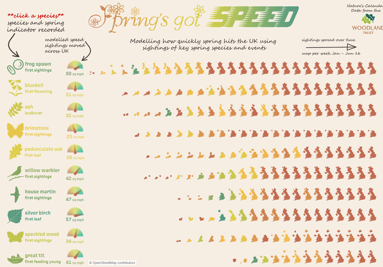
‘I should have got a stronger grip on her,’ wrote Lord Montagu in a letter home from his sickbed in Malta in 1916, after being rescued from the wreckage of the SS Persia which was hit by a German torpedo while crossing the Mediterranean.

But to his enduring pain, Eleanor Thornton, his travelling companion, personal assistant and beloved mistress, had not been saved.

Love at first sight: Eleanor Thornton and Lord Montagu. “Theirs was a great love affair. Although when he came back home he was badly injured, he spent days looking for Thorn, who had been thrown overboard, searching everywhere, hoping that somehow she would turn up.”

Of course, she never did. But though the affair between the aristocrat and Eleanor Thornton ended with her death, their love was immortalised in the most unlikely of places.

It was the inspiration for the Rolls-Royce flying lady, or ‘Spirit of Ecstasy’, whose soaring curves are modelled on Thorn and recognised by motorists across the world as a symbol of quality and distinction.

Montagu’s wife, Lady Cecil, not only knew about the affair, but condoned it. For her part, Eleanor had a child by Montagu but, knowing that as a single mother she would be unable to continue to work for Montagu, gave her daughter up for adoption.

Born in Stockwell in 1880 to a Spanish mother and an Australian engineer, Eleanor Velasco Thornton left school at 16 and went to work at the Automobile Club (now the RAC).Through her work, she met all the motoring pioneers of the day, among them John Scott Montagu.

Rolls Royce

Montagu was a charismatic figure, educated at Eton and Oxford, with a great interest in travel and transport.An MP for the New Forest Division of Hampshire, he was a great car enthusiast, who came third in the Paris-Ostend road race in 1899 and is credited with introducing King Edward VII to motoring.

The love affair of Eleanor Thornton and Lord Montagu was the inspiration for the ‘Spirit of Ecstasy’

But he was also married to Lady Cecil ‘Cis’ Kerr, with whom he already had a daughter. When he met Miss Thornton, however, the effect was instantaneous.

“I fell in love with her at first sight,” he later said. “But as I couldn’t marry her I felt I must keep away from her as much as I could. But she began to like me and realise my feelings as well.”

In 1902, when Eleanor was 22 and Montagu 36, she went to work as his assistant on Britain’s first motoring magazine, Car Illustrated, in an office on London’s Shaftesbury Avenue.

He explained: “Before long, we discovered we loved each other intensely and our scruples vanished before our great love.”

It was a love whose light never went out. When Montagu’s father died in 1905, John Scott inherited the title, becoming the second Baron Montagu of Beaulieu, and moved from the House of Commons to the Lords.

Miss Thornton was still very much on the scene, increasing her duties as his assistant accordingly. Montagu owned a Rolls-Royce and would often take her for a spin along with Charles Sykes, an artist and sculptor. This is how Thorn came to inspire, and model for, the Spirit of Ecstasy.

Rolls Royce

Montagu was friends with the managing director of Rolls-Royce and between them they cooked up a plan for an official sculpture, which at Montagu’s suggestion Charles Sykes was commissioned to design.

Sykes used Miss Thornton as a model and The Spirit of Ecstasy, or “Miss Thornton in her nightie”, as those in the know called it, graced its first Rolls-Royce in 1911.

Whether by this time Lady Cecil had worked out the truth about the relationship between her husband and his vibrant personal assistant is not clear, but by 1915, when Montagu had to leave for India to be Adviser on Mechanical Transport Services to the government of India, she certainly did.

It had been decided that Miss Thornton would accompany Montagu onboard the SS Persia. Before the trip, Miss Thornton corresponded with Lady Cecil. Her tone is tender and conspiratorial. “I think it will be best for me to make arrangements without telling Lord Montagu – so he cannot raise objections,” she writes.

Later in the letter she writes, tellingly: “It is kind of you to give your sanction to my going as far as Port Said. You will have the satisfaction of knowing that as far as human help can avail he will be looked after.”

According to Montagu’s biographer, the family felt that Lady Cecil “became resigned, with no feelings of bitterness to her husband’s affair and took the view that if he had to take a mistress then it was as well he had chosen someone as sweet-natured as Eleanor Thornton – rather than someone who might cause a scandal.”

P1040801 ss persia mir copy

But their days on the SS Persia would be the last Montagu and Thornton spent together. They boarded the ship in Marseille on Christmas Day in 1915. Five days later, on December 30, they were sitting at a table having lunch when a German U-boat fired a torpedo at the ship’s hull.

The massive blast was repeated as one of the ship’s boiler’s exploded. As the ship began to list, icy seawater rushed in through the open port holes, and in the mayhem, Montagu and Eleanor made for the decks, which were already beginning to split.

They considered trying to find a lifeboat but there was no time. One moment, Montagu had Eleanor in his arms, the next they were hit by a wall of water and she was gone. The port side of the ship was submerged within minutes and Montagu was dragged down with it. He was wearing an inflatable waistcoat and this, along with an underwater explosion that thrust him to the surface, probably saved his life.

“I saw a dreadful scene of struggling human beings,” he later cabled home. “Nearly all the boats were smashed. After a desperate struggle, I climbed on to a broken boat with 28 Lascars (Eastern sailors) and three other Europeans. “Our number was reduced to 19 the following day and only 11 remained by the next, the rest having died from exposure and injuries.”

They were eventually rescued, after 32 hours at sea with no food or water, by steamship Ningchow. Montagu convalesced in Malta, then returned home where he was flattered to read his own obituary, written by Lord Northcliffe, in the Times.

The accident left him physically frail, but for years Montagu continued to search for his beloved Thorn. He also erected a memorial plaque in Beaulieu parish church beside the family pew, giving thanks for his own

“miraculous escape from drowning” and “in memory of Eleanor Velasco Thornton who served him devotedly for 15 years” – an extraordinary public display of feeling under the circumstances.

Lady Cecil died in 1919 and Montagu remarried the following year, to Pearl Crake whom he met in the South of France.

She bore him a son, Edward, who is now the Third Baron Montagu of Beaulieu. But the repercussions of the love affair did not end with the deaths of the two women involved.

The current Lord Montagu takes up the story. “My father died in 1929, when I was two and that was when the family discovered, by reading his will, that Eleanor had had a child.

“The will made provision for her, but was worded to obscure who she was. We always used to wonder who she was and were keen to find her.

“Then my half-sister Elizabeth went to live in Devon. She was standing in a fishmongers queue one day when someone said to her: ‘See that woman over there? She’s your sister’.”

The woman’s name was Joan. She was born in 1903, soon after Montagu and Thornton began their affair, and given up for adoption straight away. The curious thing was that while Eleanor made no attempt to contact her daughter, Montagu had, on occasion, met up with her.

He also wrote her a letter explaining the circumstances of her birth – “Your mother was the most wonderful and lovable woman I have ever met… if she loved me as few women love, I equally loved her as few men love…” – that she did not receive until after his death.

Joan’s behaviour was as discreet as her mother’s. She had attended her father’s funeral, but so quietly no one even noticed she was there.

Says the current Lord Montagu: “Eventually, I got in touch and took her for lunch at the Ritz. We had oysters and she said: ‘Your father always used to bring me here and we would have oysters, too.”

Joan married a surgeon commander in the Royal Navy and had two sons, one of whom, by sheer chance, worked for Rolls-Royce.

Lord Montagu did as he knew his father would have wished. “I recognised them as full family,” he says, apologising for the tears on his cheeks as he recounts the moving story.

And so, a century after Eleanor Thornton and John Montagu met, their story has now passed into history.

But the spirit of their feelings lives on, in the form of the figurine that still graces every Rolls-Royce.

abridged version of The Great Rolls Royce Love Story,

printed in the Daily Mail,1 May 2008


You’ll please forgive this rather random introduction. It was the above story (not the Daily Mail version midn you) in the Buckler’s Hard Maritime Museum (in one small corner of a much larger museum), discovered while on on holiday two weeks ago, that peaked my interest. [Not just mine either – you can find out much more at https://sspersia1915.wordpress.com/]

The SS Persia sank on was sunk off Crete, while the passengers were having lunch, on 30 December 1915, by German U-Boat commander Max Valentiner (commanding U-38). Persia sank in five to ten minutes, killing 343 of the 519 aboard.

The story of Lord Montague, his love affair, his inflatable waistcoat that had been purchased in advance of the trip and likely saved his life (the actual jacket is in the museum), as well as the trip of a British Steamer through openly hostile waters of the Mediterranean and the U-Boat Commander’s apparent disregard for civilian lives struck me as fascinating.

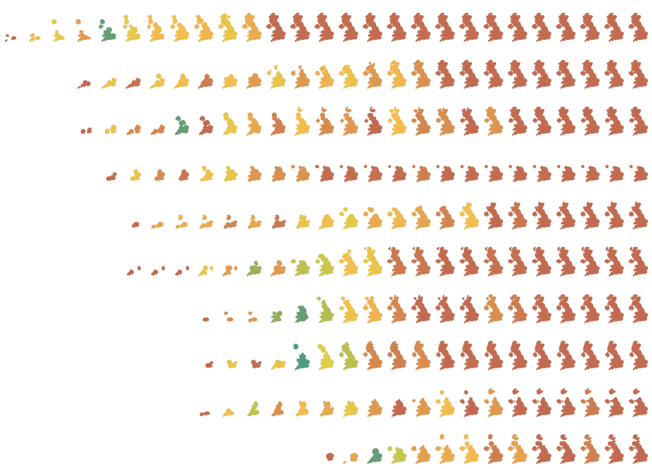
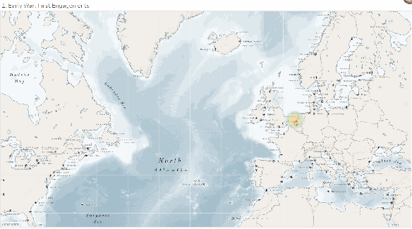
Having long held a fascination with U-Boats when I was deciding on a theme for my Water Iron Visualisation I decided to research U-Boats of World War 1 in more detail. You can see my visualisation below (click the picture to explore).

Data Gathering

Looking for data I found uboat.net, this amazing site lists every ship attacked by U-Boats in both World Wars and also plots the location of the majority of them where know. It also includes details of the attacking U-Boats, their commanders as well as the fate of the U-Boat itself. It’s a literal tour de force and I spent a long time perusing the site.

I have difficult time with the morals of scraping data from third-party sites, clearly someone has put time into collecting this data and it’s theirs to share but I decided to use the data under the principles of fair use. I already have access to the data, made a whole copy, I am using the data for computational analysis and study and my work will increase interest to the site (well I certainly hope it will). I have also attributed the data. let me know your thoughts on a fairly grey area that I (and others) struggle with.

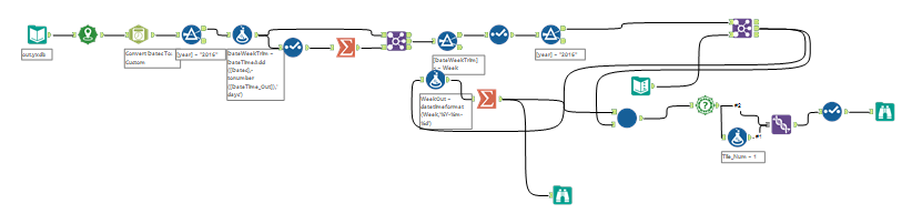
I used Alteryx Download tool to download the data

This looks complex but actually the initial starting point was just half of the first row of tools to download the ships hit. As I built the visualisation I added other segments that downloaded details of the U-Boats, their fates and then parsed out their sinking locations from the notes using Reg Ex, as well as joining on Ocean areas geographically. Each task was a discrete item consisting of a few tools after I’d spent time with the data set in Tableau building and analysing.

This back and forth workflow is key to the way I work and I talk about it a lot, I make no apologies for that though as it really is essential to the way I think and work. I had a few draft design ideas in my head but I never sketch things out or plan them ahead of time – I prefer to let the data guide my hand and eye, eventually using the analysis and visualisations I create to inform the final viz and design. I created 40 separate visualisations as part of this project and then stepped through them looking for stories in an effort to weave together a narrative.

Inevitably there are elements it’s frustrating to miss out, you’ll find no mention of the U-Boat commanders with the highest number of kills in the final viz for example – partly I didn’t want to glorify the horrific crimes they committed but partly they just didn’t weave into a coherent and structured story.

Design Decisions

Long form? Story-points? Wide form? Single page? I toyed with a lot of these in my head but eventually I opted for story-points as a way to tell the story. It sounds quite obvious but the decision was hard purely because of the design limitations story-points places on me as an author. The height and position of the story points for example can’t be controlled, nor can graphics be added outside the dashboard area. You’re also forced into a horizontal / left – right set of story points. All these felt like limitations that restricted me but with hindsight they probably made my life easier from a design standpoint and stopped me worrying about large aspects of the design.

My second difficult decision was how to entwine other charts into the visualisation and story. I built the map fairly quickly and knew that would be the centre piece of the visualisation but wasn’t sure how to bring other charts in without affecting that beautiful look Mapbox had helped me achieve with the map. I’m not sure I’m 100% happy with the result but by keeping colour schemes similar and also using a lot of annotations in both (and keeping the consistent top-left annotation) I think I just about got away with what I was trying to achieve. This consistency was a key factor at play in designing the whole visualisation.

Data Visualisation and Analysis

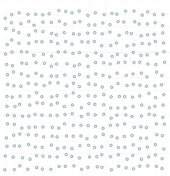
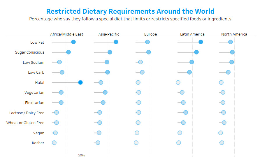
From a visualisation perspective the biggest think I struggled with was the occlusion of the attacks on the map. My original larger points offered a good differential to see the different tonnage involved but the smaller points, second image below, offers less occlusion thus giving more visibility of the true density. Playing with opacity wasn’t an option (see below) and so I opted for the smaller points in the end despite them being a touch harder to see.

Would the new Tableau Density Mark type have helped:

In this case no I don’t think it would have – I prefer to show every single attack and sinking rather than obscuring them into an amorphous blob. Density mapping works to tell me where the main theatres of war were but doesn’t help pull out the main attacks and help the story in my opinion. Likewise, the two combined is even worse – yuck (perhaps improving the colours here may help).

So for those dying to see the new Density Mark feature, as with everything in data visualisation, my advice would be it’s best used sparingly and for the right use case.

Other data visualisation matters were in the use of the rolling averages and rolling sums – how understandable is a rolling sum of U-Boats sunk, it allows a useful comparison measure when there are low numbers (much more than an average) but takes some understanding. Here I opted to include the visualisation with some explanation.

Storytelling

Storytelling was to be a huge focus of the visualisation and a key to pulling the whole thing together. A timeline of the war was to be the structure and I was keen not to deviate from that – using data to illustrate points I’d pulled from research (with limited time it’s hard not to focus on just one source but I pulled several together and actually ignored some claims that were made in some source as I couldn’t justify them with the data I had).

I wanted the timeline to focus on the human and political aspects of the visualisation, as well as some the famous, and not so famous stories. I also wanted to get across the full scale and horror of these attacks – 1000’s dying trapped in a sinking ship under a storm can sometimes get lost as an emotionless point on the map. These aims were not easy to bring together, especially in a limited time-frame and I’m most disappointing about the last point – I feel I’ve not truly got across the nature of those deaths and the true horror of the sinkings. That said I feel it’s very hard to achieve in visualisations without falling into cliched visualisation types, all of which have been done before, and so rather than go down that rabbit hole I stuck to telling the stories in the limited space I had and trust the user to imagine the horror.

Balance between the text, the visualisations and keeping the length of the story relatively short was another difficult aspect. Again I’m relatively happy with the result but I had to sacrifice a lot of the detail and miss out interesting stories and acts of heroism in an effort to keep it short (including my original inspiration above). I’ve no real advice here for others except that it is a constant juggling act and something you’ll never be truly happy with.

Wish list

I thought I’d finish with a list of things in Tableau that I found hard, or harder than they should be. Spending just 24 hours on data collection and visualisation of this scope is testimony to the geniuses who build Tableau and Alteryx but there’s always ways it could be improved – here were some of my pain points and how I overcame them.

Borders on Shapes – I wanted to keep the U-Boats sinkings a different shape from the attacks (circles) for obvious reasons, but the result was the circles lost their border….not ideal! For aesthetic and analytical reasons I think the border adds a lot.

The workaround I applied was to duplicate the data and add a tiny portion to the size of the shadow data point, then colour the two differently. I then ordered the points in the detail pane by an ID so the shadow appeared directly below the mark and no other marks were between them. Each “mark” in the viz was actually two, one real and then the shadow below it.

The real colour legend below shows what I had to do here. This was a reasonable amount of effort to work out and then removing the shadows for aggregations elsewhere was a pain (I could have used two data sources I guess).

Of course the result was I couldn’t change the opacity either.

MapBox – I had to add my own bathymetry polygons to the North Star map as their version of the bathymetry rasters didn’t work about Zoom Level 3, I needed to zoom out further! This took a lot of faffing in map box studio (probably because of my inexperience).

Annotations – please, please, please can annotations be easier in Tableau, losing them every time I add a dimension to the visualisation is painful. Not to mention using them with pages in Storypoints seems to be slightly hit and miss – at one point I lost all of them, whether it was my fault or not I’m not sure but it was a painful experience.

Storypoints – as an infrequent user of Storypoints I generally found them easy to use, however I look forward to the day I can customise and move the buttons as much as I can style the rest of my visualisation

Alteryx – I’d love some easy web page parsing adding to be able to select patterns in HTML and pull them out – I do this so often! I’m a dab hand now at (.*?) in regex but I’d love there to be more.

Iron Viz – I go on holiday for two weeks every August for two weeks, please consider using a different time for the feeder to reduce my stress levels when I return 😀

Thanks for reading – I’d love to hear your critique of my efforts in the visualisation, what worked what didn’t. Also consider giving it a “favourite” in Tableau Public – I’d appreciate it. Here’s the link again: https://public.tableau.com/profile/chrisluv#!/vizhome/TheU-BoatinWorldWarIAVisualHistory/U-BoatsinWW1


IronViz Feeder 2 – Retrospective

An interview with myself looking back at the recent IronViz Feeder for Health and Well-Being. Below is my final visualisation, click for the interactive version.

Takeaways

Perhaps I can start by asking you what you thought about this Iron Viz theme, did it get you excited – did you immediately have themes that sprang to mind?

To be honest I have a love / hate relationship with these feeders, on the one hand I love the open-endedness of the theme, yes it’s a guide but you can go almost anywhere with it, but for me it still feels too open to mean my imagination struggles to settle on one particular idea.

I was already doing some work for a Data Beats article on Parkrun and their accessibility and I initially wanted to cover this but what I had in mind didn’t fit nicely into a single visualisation or set of dashboards. I also had in mind some work on Agony Aunts – comparing the Sun’s Dear Deidre to The Guardian’s Mariella Fostrop based on the words they used – but the analysis started taking too long….

So that’s an interesting point – how do you balance out the various aspects of visualisation when choosing a subject? Do you choose subjects that require little data preparation so you can maximise data visualisation time or look for more complex subjects? 

When choosing a subject I’m primarily interested in choosing a subject that interests me. If the subject do that then it isn’t going to make me want to stay up til 3am working on it, or dedicate hours outside work. Let’s face it, I’m not in IronViz to win the thing, although I’d love to, there’s just too much talent and competition out there for me to compete, and so I’d rather just have fun doing a visualisation.

That said, I also don’t want to pick a subject that feel’s too easy – I like to work at my data and perform some analysis, I want to be able to say “This is what I found” rather than “This is what the dataset I found said”. The difference is subtle but I see this as a direction my public visualisation path is taking more and more lately. So I want to build and define my own analysis and say something with it – I do take inspiration from other sources, after all very little is new or novel today, but for me the analysis is as important as the visualisation itself.

This is where too the “data journalism” aspects of data visualisation are important, in the IronViz scoring criteria this is labelled as “Storytelling”.  However you label it I interpret it as not just showing the numbers. Anyone can show numbers visually, they can show the highest and the lowest and the relationship between them. They can design a dashboard and they can publish it. That isn’t data storytelling though, it’s data presentation. I want to convey why someone should be interested in the numbers, what do the numbers tell us and why is it important, and what should we do because the numbers show what they do.

So you mean adding commentary?

Well yes, but that’s only part of what I’m talking about. What I’m getting at is that this storytelling goes right back to the data choice, the subject choice and the analysis. And it’s not about presenting numbers back that people should care about either; it’s about doing some meaningful analysis and telling a story that is different, not the same old numbers presented in a different way.

It sounds like you feel the way you approach IronViz now is perhaps different to the way you’ve approached it in the past. What’s prompted it do you think?

Certainly it’s been a journey to get to this point, probably starting with my Springs got Speed visualisation in last years Iron Viz. As to what has prompted a shift towards this more analytics direction, well I suppose it’s the same things that prompted Rob and I to start Data Beats. Sometimes you look at the Iron Viz entries and you feel like you’re in a game where everyone is kicking the ball when suddenly someone comes in, picks it up and starts running with it. Over the last year or so the norms in the Tableau community certainly seem to have shifted; what was considered good a few years ago is now very, very average and people are pushing boundaries left right and centre.

When people start pushing boundaries you really are left with two choices; you can either find your own boundaries to push or settle down and try to do the basics really, really well. So while perhaps in the past I was happy to push boundaries, there are now others who do much wilder stuff than I ever could – and so I really need to hunker down and do the basics as well as I can.

So tell us about your Iron Viz. Where did the idea come from and how did you choose to approach it?

I decided to look at how deprivation is linked to the number of takeaways in an area, looking back I think like any good idea it didn’t come from any one source, instead it came from several seeds over time. Certainly walking around my own town, which is in a relatively deprived area I see a lot of takeaways, we get new takeaway leaflets every day and, where once the town centre was made up of lots of different stores now I see about twelve takeaways (contrast this to just two as I was growing up – in perhaps 500m of shops). There’s been some similar research on these links already, this article sticking in my mind recently.

Having explored other ideas and failed I knew I could get this one off the ground quickly – I’ve played with the Food Standards Agency’s Ratings data before and knew I could download that to get a classification of takeaways, while deprivation is easy calculated from the Index of Multiple Deprivation. So the problem seemed relatively simple given my limited time.

Speaking of time, how long did your visualisation take?

I didn’t have long enough, the world cup, TC Europe and several camping holidays meant that I really dedicated just the last day of the time allowed to this. I started about 3pm and, with several breaks to see to the family and eat, I was working til 3am.

I wouldn’t recommend this approach, it meant I had very little time to iterate on the visualisation, I had no time to get feedback from any peers and very little time to step back and consider what I was doing.

What took the longest time?

I settled on the data and story fairly quickly, using Alteryx to pull the data together. However the design was something that I hadn’t worked out before starting, and well over half the time was spent on trying to come up with ideas.

I started off the idea to put the article on a newspaper, partially covered by fish and chips (that’s how we eat them from takeaways traditionally in the UK); there were however several difficulties. First and foremost, I need any design to use images I have created or that are free to use. Finding an image of fish and chips at the right angle and with a transparent background was hard with no copyright was hard, also I wanted to have the article crease like it was folded which would have been quite a bit of work.

I quickly returned to the drawing board with very few ideas as to how to approach my visualisation design. I’d wasted 2 or 3 hours looking for images and I needed something quick. In desperation I googled “Takeaway” to look for related images and that’s where the takeaway menu hit me – and the idea was born.

The design looks quick complex – what software do you use?

I actually have a licence of photoshop I use for photography but I’m not a very good user, I can understand layers and some elements so I used that to piece together the design.

Wait, Photoshop? and you use Alteryx? Other people don’t have those advantages?

No, but let’s be clear I only use them because I have licences and have put effort in to learn them. All the work I did in Photoshop I could have done in Gimp, SnagIt Editor or even Paint. Likewise the data prep work could have been done in Tableau Prep (aside from joining on the spatial files which could have been done in Tableau) or I could have used other free software like EasyMorph.

So back to the design, where did the actual Takeaway design come from?

I copied took inspiration from this design from a menu designer, I then played around with the sizes and colours until I was happy.

What blind alleys did you go down in producing your Iron Viz?

Lots! Isn’t that what Iron Viz is all about. I really wanted to add an extra geographic element to the visualisation, and look at the relationship at perhaps 1km grid level. I did the analysis but the relationship I wanted to see just wasn’t there due to geographic anomalies i.e. town centres have a lot of shops but not many people. I tried extending the analysis out to 3km or 3 miles but there was too much noise in the data, remote areas were completely distorting the story and there were no patterns I could. In the end I settled for the simple analysis.

What was the hardest part did you find?

Having done so many Data Beats projects lately, I found it incredibly hard to limit myself to a single dashboard. I’ve got so used to using words to tell my story and explaining it over several paragraphs with visualisations to help me a long the way then this was incredibly frustrating – I had so much to say but not enough space to say it.

You said in the last Feeder you were too intimidated by the competition to enter. What changed your mind to enter?

I regret not entering the first feeder. My thought process came from my competitiveness – I really want to win this thing and I feel the competition is such that I might not be able to. Coupled with the fact the time has increased to a full month I really struggled to create enough time to compete with some of the stronger entries. Before a few hours was enough to compete, now it’s not even close.

But my thought process was wrong, trying to win Iron Viz is like trying to win the London Marathon – it takes hours and hours of practice and training in the build-up to get even close. Does that mean it’s not worth it? No. The fun is in the taking part – I’d encourage everyone to take part and just give it a go. It’s a fun project and something that only comes around 3 times a year.

What about the other entries, any favourites?

For analysis I have to choose my good friend Rob Radburn’s: Who Care’s. Rob has an instantly recognisable style and his commentary and analysis really shine in this piece.

For Story-Telling I’d say Mike Cisneros’: Last Words is just beautiful. Mike pulls together visualisations that might be just “show me the numbers” but binds them with stories of last letters home which just break the heart.

For Design Curtis Harris’: If I was Kevin Durant wins the day for me, it’s just a beautiful piece of  work, not over reliant on imagery – just all about the data.

There are lots more I could pick out but these are some of my favourites.

Those are all amazing pieces of work, thanks for sharing Chris and good luck with Iron Viz.


What happens at The End?

This is a post is a small thought about one piece of Data Visualisation best-practice.

“Jeez Chris, get a life”. Yes, I know, here I am again. Get over it. I happen to think this stuff is quite important.

This is a reply to and critique of the chart made by Jeff Plattner and recreated by Andy Kriebel in his blog post Makeover Monday: Restricted Dietary Requirements Around the World | Dot Plot Edition

I’d originally fed back on best practice to Jeff on Twitter but given Andy has chosen to recreate the chart and has a huge audience for his blog I felt it was worth a blog post in reply to point out, what I think, is a small best practice failings in the chart.

Let’s compare the three charts below, the last being Jeff’s original:

Bars

Bars – Andy’s Initial Makeover

Lollipop

A Lollipop Chart based on Andy’s Makeover of Jeff’s

Dot Plot

Jeff’s Original

I love Jeff’s take on this subject. I immediately fell in love with the design and loved the “slider ” plot which I’d not seen used so effectively.

However there is a subtle difference between this last chart and the two above.

All three have axis that shows the range of the bars / lollipops / sliders at 50%. This is a design choice which both Andy and Jeff (for the first and third charts) both said came from wishing to make the chart look better.

Chart

Now here comes the rub for me. In the first two the shrinking of the axis doesn’t take away from the audiences understanding of the chart. However in the last “slider” chart it does. Why? Because the chart has an end.

Why “The End” matters…

The end of a visualisation mark / chart is important for me, because if it exists then it implies something to the reader. It implies that

a. the data has a limit

b. you know where the limit is and can define it

c. you have ended the chart at the same place as the limit of the data

Let’s look at the three aspects here with our data

a. ✔ the limit of the data is 100%

b. ✔  no region can be more than 100% of a given diet

c. ✖  the line ends at 50% in Jeff’s chart

Why doesn’t this matter for the first two charts? Well these two charts don’t have a limit set by the chart. Yes, the bar and lollipops end, but we’re forced to look elsewhere to see the scale. With the “slider” chart, then in my opinion, the reader feels safe to assume that a dot half-way along a line means that half the people in that area follow the diet. They don’t go further to look for the scale – despite the fact Jeff has clearly marked the limits.

This perceptual difference between the charts is important for me, and a good reason not to limit the axis at any other value than 100%, as I have done below by remaking Andy’s Remake. Dot Plot 100%

It this the biggest faux paux in the history of Data Visualisation? On a scale from 0 to 3D Exploding Pie Chart then we’re at 0.05. So no, not really, but I thought it was interesting enough to share my thoughts on what was an excellent Viz by Jeff.

As ever these are only my thoughts, they’re subjective, and many of the experts may not agree. Let me know what you think. Is the visual improvement worth the sacrifice of best practice?

Comment here or tweet me @ChrisLuv

Spring’s Got Speed

I must admit when Iron Viz was announced for this qualifier I had mixed feelings. On a positive side I know nature and animals, as a photographer and bird watcher I’ve spent a long time gathering data on animals. I even run a website dedicated to sightings in my local area (sadly it’s been neglected for years but still gets used occasionally). On the negative side though I knew I would be faced with competition from a bunch of amazing looking visualisations, using striking imagery and engaging stories.

Did I want to compete against that? With precious time for vizzing lately (especially at end of quarter – you can tell the Tableau Public don’t work in the sales team!) I only wanted to participate in Iron Viz if I could be competitive, and for those who don’t know me I like to be competitive….

So, as you perhaps guessed, my competitive edge won and I pulled some late hours and risked the wrath of my family to get something that did the competition justice.

A Note On Visualisations and creating a Brand

I’ve noted above I expected a lot of pictures and text from people in this qualifier, after all Jonni Walker has created his own brand around animal visualisations, stock photography and black backgrounds. However I have my style of visualisation,  I’m not Jonni Walker, what he does is amazing but there’s only place for so many “Jonni Walker” vizzes. I couldn’t replicate what he does if I tried.

In the past I’ve deliberately combined analytics and design, treading the fine line between best practice and metaphor, staying away from photograph and external embellishments and preferring my visualisations to speak for themselves through their colours and data. The subject this time was tricky though…was it possible to produce an animal visualisation without pictures?

Finding a Subject

I could turn section this into a blog post on it’s own! . I trawled the internet for data and subjects over days and days. Some of the potential subjects :

  • Homing Pigeons (did you know their sense of smell affects their direction)
  • Poo (size of animal to size of poo) – this was my boys’ favourite
  • Eggs (had I found this data I’d have been gazumped: http://vis.sciencemag.org/eggs/)
  • Zebra Migration
  • Sightings Data of Butterflies

Literally I couldn’t find any data to do these enough justice, I was also verging on writing scientific papers at points. I was running out of ideas when I found this website: http://www.naturescalendar.org.uk/ – and I dropped them an email to see if I could use their data. Phenology (studying natures cycles) has always interested me and getting my hands on the data would be fantastic. There was even a tantalising  mention of “measuring the speed of spring” on their news site with some numbers attached but no mention of the methodology….

Now, I’m impatient and so….using a few “dark art” techniques I didn’t wait for a reply and scraped a lot of the data out of their flash map using a combination of tools including Alteryx.

Thankfully a few days later they came back and said I’d be able to use it (after a short discussion) and so all ended well.

Measuring the Speed of Spring

Now I had the data working out how to measure my own “speed of spring” was difficult. Several options presented themselves but all had their drawbacks…the data is crowd-sourced from the public, mainly by people who can be trusted but amateur outliers could affect the result (do you want to say Spring has hit Scotland based on one result). Also the pure number of recorders in the South East, say, could affect any analysis, as could the lack of them in say, Scotland. Given we’re expecting to see Spring move from South to North then that could seriously sway results.

In the end I played between two methods:

  1. A moving average of the centroid of any sightings – and tracking it’s rate of movement
  2. A more complex method involving drawing rings round each sighting and then tracking the overall spread of clusters of sightings across the UK.

In the end I opted for the latter method as the former was really too likely weighted by the numbers of sightings in the south.

Very briefly I’ll outline my methodology built in Alteryx.

  1. Split the country into 10 mile grids and assign sightings to these based on location
  2. Taking each grid position calculate the contribution to the surrounding grids within 50 miles based on a formula: 1-(Distance/50). Where Distance is the distance of the grid from the source grid.
  3. Calculate the overall “heat” (i.e. local and surrounding “adjusted” sightings) in each grid cell
  4. Group together cells based on tiling them into groups dependent on “heat”
  5. Draw polygons based on each set of tiles
  6. Keep the polygon closest to the “average” grouping i.e. ignoring outliers beyond the standard deviation

I then did the above algorithm for each week (assigning all sightings so far this year to the week) and for each event and species.

These polygons are what you see on the first screen in the visualisation and show the spread of the sightings. I picked out the more interesting spreads for the visualisation from the many species and events in the data.

Small Multi Map

The above process was all coded in Alteryx.

Alteryx

If you look closely there’s a blue dot which calls this batch process:

Alteryx Batch

which in turn calls the HeatMap macro. Phew, thank god for Alteryx!

Now to calculate the speed, well rate of change of area if you want to be pedantic! Simple Tableau lookups helped me here as I could export the area from Alteryx and then compare this weeks area to the last. The “overall speed” was then an average of all the weeks (taking artistic licence here but given the overall likely accuracy of the result this approximation was okay in my book).

Iterate, Feedback, Repeat

I won’t go into detail on all the ideas I had with this data for visualisation but the screenshots will show some of what I produced through countless evenings and nights.


“Good vizzes don’t happen by themselves they’re crowdsourced”

I couldn’t have produced this visualisation without the help of many. Special mentions go to:

Rob Radburn for endless Direct Messages, a train journey and lots of ideas and feedback.

Dave Kirk for his feedback in person with Elena Hristzova at the Alteryx event midweek and also for the endless DMs.

Lorna Eden put me on the right path when I was feeling lost on Friday night with a great idea about navigating from the front to the back page (I was going to layer each in sections).

Also everyone else mentioned in the credits in the viz for their messages on Twitter DM and via our internal company chat (I’m so lucky to have a great team of Tableau experts to call on as needed).

Difficulties

Getting things to disappear is a nightmare! Any Actions and Containers need to be in astrological alignment….

Concentrating on one story is hard – it took supreme will and effort to concentrate on just one aspect of this data

Size – I need so much space to tell the story, this viz kept expanding to fit it’s different elements. I hope the size fits most screens.

The Result

Click below to see the result:

Final.png


On Conference Etiquette and Poor Talks

We’re starting Conference season in my small corner of the data world, with Tableau and Alteryx conference happening simultaneously in London and Vegas respectively. Sadly I’m missing out on my first Alteryx Inspire in a number of years – I hope my friends in Vegas have an amazing time.

As these conferences draw near we’re always treated to an array of advice from seasoned attendees around how to get the most of your experience and so I wanted to add my opinion to this growing pile of tips and tricks. In doing so I want to challenge what seems to be accepted wisdom in conferences I attend among the many bloggers and tweets I follow, the advice goes something like this:

“If you’re not enjoying a talk then walk out and find something else – your time at conference is valuable”

Personally I think this is the worst advice you could be given. Not only is it rude, it also makes a bad situation worse. So let’s show you how to rescue those poor talks and turn them into a positive experience.

1. Choose your talks wisely

Take time to use the conference apps and schedules well in advance of the conference, take the time to research the speakers and topics. If you wish to learn something in particular, or already have some knowledge on the subject, then seek out opinions from peers or the speakers themselves, if you can reach them, on whether your attendance is worthwhile.

Sometimes it’s worth attending a talk not for the content itself but in order to connect with the person afterwards, particularly if they share a common interest or specialism or the same industry.

Whatever the reasons for attending the talk make sure you are clear on them before you walk through the door to attend. Ask yourself (if there are multiple sessions you wish to see) if there are ways to get the same outcome without attending, e.g. arranging to meet the speaker for a 1-to-1 (most speakers are only too flattered to be asked for a coffee to chat through their subject in detail) or watching again online. Try to choose the talk you’d like to ask questions in if the sessions are recorded.

In summary I’d perhaps go as far to say there’s no such thing as a bad session, only poorly chosen ones. You owe yourself, and the speaker, the duty to choose your session carefully.

2. Walking out won’t help

So, if you followed the above advice, you chose, quite deliberately, to come along to this talk. You know why you came and you know what you want to get out of it. You consider the speaker to have something interesting to say, otherwise you wouldn’t be here.

But now the talk isn’t going well. Perhaps the speaker has a voice that belongs on the shipping forecast more than a conference, or perhaps they’re having all sorts of technical problems – those perfect dashboards just won’t render on the conference screens – or maybe they’re nervous and can’t get their words out quite as they intended. Maybe they just didn’t have time to prepare. Maybe they’re reading out their slides to the audience! Whatever the reason walking out is likely to only make a bad situation worse.

Why? Firstly you now have to run across a large conference venue and, if you’re lucky, join your well researched second choice talk rather late. More probably you didn’t have a second choice and so you just run into the nearest room, or your second choice is full and you can’t get in. You might even be forced to just grab a coffee and play pinball. Whatever happens you won’t have the clear outcomes you wanted from your primary choice – and so you’re likely to not find it as valuable (not least because you missed some).

More importantly though what happened to all those reasons for attending the first talk? Did they go away? Of course not, so you’re giving up on a massive opportunity to rescue your original mission.

auditorium, chairs, comfortable

3. Just be Polite

As a speaker I have to say there’s nothing more off-putting than seeing people leave. At conference, in a large venue then really it is to be expected, but many speakers at our data conferences aren’t professional speakers and they’re in relatively small rooms. They’ve given up there time to prepare a talk (which take a lot of effort – more than 99% of attendees have done). The least effort you could put in, having decided to attend, is make a small commitment of all 40-50 minutes of your time.

So make sure you’ve been to the bathroom, make sure you listen and engage with the speaker, try and avoid WhatsApp conversations moaning about the speaker to your friends in other sessions, avoid Facebook for an hour, because you can use the opportunity to potentially turn what could be a wasted 40-50 minutes back into a great learning opportunity.

If you do think you’re prone to voting with your feet then please sit by the door and try to avoid a minimal fuss as you leave. Also remember doors can slam in conference halls – so close doors behind you.

4. Rescuing the Situation

Yes, poor talks happen, as we’ve said, for a variety of reasons, but assuming you’ve decided to stick around then you can rescue the situation and still achieve your original objective for attending the talk.

How do you rescue the situation?

  • Be patient – speakers, particularly customer speakers, are often nervous and so they’ll take a while to loosen up.
  • Think of questions – focus on what the speaker isn’t saying, that’s often the more interesting stuff. How does that tie in with what you wanted to get out the session? Write down a set of questions as the speaker goes through?
  • Ask questions at the end – new speakers will more often than not under-run, leaving plenty of time for questions. This is your chance to really get what you need to know. Tie questions back to what the speaker was saying to show you were listening and ask them to expand on areas of interest to you. Often getting a speaker ad-libbing about something they feel passionate about is where you’ll really start to learn something.
  • Approach the speaker at the end of the talk – as the room empties make sure to say Hi. You could even offer to buy them a coffee if you still haven’t got what you wanted from the talk. Remember you chose this person as an expert in a field you were interested in, one bad presentation doesn’t mean they don’t have something interesting to say.

Prepare well and remember your objectives

In conclusion you owe yourself the duty of preparing well for the talks you want to attend, that preparation will help you focus on what you want to achieve and help you through any sessions that don’t live up to your expectations.

Walking out and leaving poor survey feedback isn’t your only choice, in fact it is likely to be the worst choice you can make. Make the most of the experts the conferences lay on for you and enjoy yourself.