
My recent data visualisation The Fallen Leaves of Mrs May’s Magic Money Tree is the first visualisation I’ve been genuinely proud of for quite a long time, perhaps only my U-Boat visualisation in 2018 managed that last year.

Why Create this Data Visualisation?
I was inspired by Dan Wainwright of the BBC and his recent article “How spending cuts changed council spending, in seven charts“. Using data from the Ministry of Housing, Communities and Local Government Dan compared council spending cuts in several areas.
Dan’s article was great, but I was left wondering what else could be done with the data. I experimented with Beeswarm plots to show outliers and several scatter plots to try and pick apart the story but nothing really helped pick out details for me. The charts I was left with weren’t engaging enough to tell an important story about the squeeze on local government, I was left trying to think of new ways and chart types to engage and show the story.
How I Developed the Idea
Several weeks and Christmas went by and I’d all but forgotten until yesterday evening I was thinking about displaying data as leaves on a tree – I had no real dataset in mind but I was thinking about the tree itself, and the leaves, might be a good metaphor with the right data.
My mind then returned to the MHLCG data – could I use this? Prime Minister May’s famous Magic Money Tree might make a great metaphor. So I got to work…
My original “leaf” looked like this:

I was imagining a tree covered with small versions of this leaf, I experimented creating the leaf out of data itself, trying to join the points, perhaps based on the spend different services – all to try and create the shape of a leaf. . However that was hard – and didn’t look great (or much like a leaf).
I also experimented with leaves like this

Perhaps with each smaller leaf node representing a different service. However I quickly gave up as due to the makeup of local government in the UK different council types are responsible for different services and finding a balance was hard (not to mention technically sizing the leaves individually in Tableau).
Finally I settled on an idea (note the above iteration and experimentation took 30-45 mins). I realised a tree might be hard but a forest floor in Autumn might show the leaves falling from May’s tree, and the colour (giving it an autumnal feel) would show the size of the cuts. The overall feel would be a big view of orange / autumn presenting a great metaphor for how cuts are hitting councils
How would the forest floor be represented? I wanted all my design choices to matter – that concept in data visualisation is very important to me.
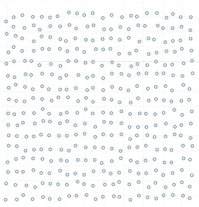
I wanted the position of the leaf to matter – so I opted to show the rough location in the UK.
.
I wanted the size of the leaf to matter – so I opted to show the total spend on services in 2017/2018.
I wanted the colour of the leaf to matter – so I showed the change from 2012/13 to 2017/18.
I wanted the type of leaf to matter – so I used it to show the type of council.
I wanted the rotation of the leaf to matter – but without creating an extra unneeded variable I couldn’t make it work, so I made it random.
Once that was decided the build was relatively easy.
What was difficult?
Setting the X, Y locations based on locations in the UK was complicated but not difficult. I opted to use Processing to generate a spatial treemap (I used the methodology Rob Radburn talked about with me here: https://www.youtube.com/watch?v=w8WpyenYggo). I then used the centroid of each square to locate my leaf.

However the resulting grid wasn’t appealing to the eye so in Tableau I added a random() number to each lat / lon – scaling so that the result looked good but minimised overlap.
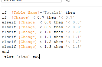
The aesthetics was also hard to get right, without stem the leaves looked flat and boring.


To add the stem I duplicated the dataset, and then used the shape mark to add “Table Name” to the shape – the first would be encoded to the Shape of the leaf, the second (at the same co-ordinates) would be encoded to the stem (which I cut from the original pictures using photoshop). If the latter was on top and coloured correctly it would work perfectly – and without the limitation of dual axis in Tableau which makes the stem appear on top of all the leaves.
Finally I haven’t talked about achieving the rotation – to do this I needed to brute for it. I used SnagIt to batch rotate the leaves and stems in 6 arbitary directions.

The shapes could then be encoded to a randomly generated number from 1 – 6 in my original data [Number], using that I could then create a field of Class (for leave Type), TableName (for stem / no stem) and {Number] to generate an encoding for colour.

After that I then simply needed to add this field to Shape and assign the shapes from the folder above in order.
I used a discrete bin of colours so I could colour the Stem separately, using the Table Name again to pick out the Stem.
Feedback
Once released I realised a few things, namely thanks to feedback from one user that the autumnal theme wasn’t suited for colour blind users – I was tempted to ignore given the theme but in the end I used parameter to add a blue colour to the theme.

In Conclusion
This was a fun build, completed, thanks to Tableau, in around 3 hours. I love the way the metaphor works in the visualisation – I think if you’re representing Council cuts as something abstract like we are here you need a strong reason, you can’t just pick any object. I think the magic money tree analogy works well for that reason, as does the title.
tldr; I had fun doing this. Which is the point.
