Using Inspect / Javascript to scrape data from visualisations online

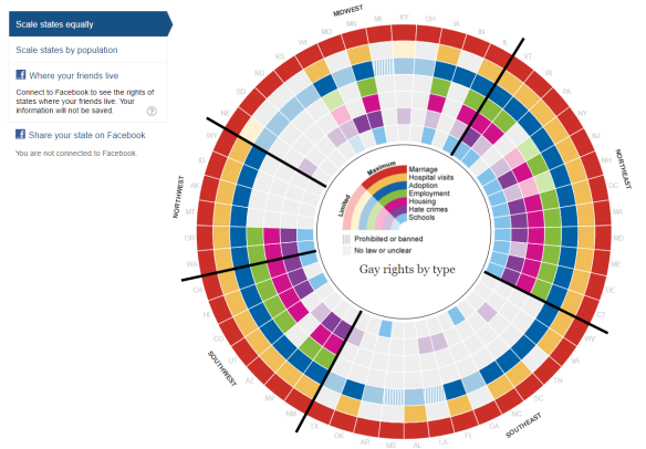
My last post talked about making over this visualisation from The Guardian:

2016-11-13_12-55-29

What I haven’t explained is how I found the data. That is what I intend to outline in this post. Learning these skills is very useful if you need to find data for re-visualising data visualisations / tables found online.

The first step with trying to download data for any visualisation online is by looking checking how it is made, it may simply be a graphic (in which case it may be hard unless it is a chart you can unplot using WebPlotDigitiser) but in the case of interactive visualisations they are typically made with javascript unless they are using a bespoke product such as Tableau.

Assuming it is interactive then you can start to explore by using right-click on the image and choose Inspect (in Chrome, other browsers have similar developer tools).

2016-11-13_19-26-35

I was treated with this view:

2016-11-13_19-28-09.png

I don’t know much about coding but this looking like the view is being built by a series of paths. I wonder how it might be doing this? We can find out by digging deeper, let’s visit the Sources tab:

2016-11-13_19-31-30

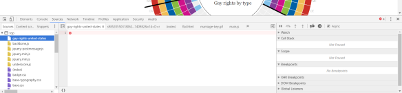
Our job on this tab is to look for anything unusual outside the typical javascript libraries (you learn these by being curious and looking at lots of sites). The first file gay-rights-united-states looks suspect but as can be seen from the image above it is empty.

Scrolling down, see below, we find there is an embedded file / folder (flat.html) and in that is something new all.js and main.js….

2016-11-13_19-34-05

Investigating all.js reveals nothing much but main.js shows us something very interesting on line 8. JACKPOT! A google sheet containing the full dataset.

2016-11-13_19-38-25

And we can start vizzing! (btw I transposed this for my visualisation to get a column per right).

Advanced Interrogation using Javascript

Now part way through my visualisation I realised I needed to show the text items the Guardian had on their site but these weren’t included in the dataset.

2016-11-13_19-41-27

I decided to check the javascript code to see where this was created to see if I could decipher it, looking through main.js I found this snippet:

function populateHoverBox (type, position){

 var overviewObj = {
 'state' : stateData[position].state
 }
.....
if(stateData[position]['marriage'] != ''){
 overviewObj.marriage = 'key-marriage'
 overviewObj.marriagetext = 'Allows same-sex marriage.'
 } else if(stateData[position]['union'] != '' && stateData[position]['marriageban'] != ''){
 overviewObj.marriage = 'key-marriage-ban'
 overviewObj.marriagetext = 'Allows civil unions; does not allow same-sex marriage.'
 } else if(stateData[position]['union'] != '' ){
 overviewObj.marriage = 'key-union'
 overviewObj.marriagetext = 'Allows civil unions.'
 } else if(stateData[position]['dpartnership'] != '' && stateData[position]['marriageban'] != ''){
 overviewObj.marriage = 'key-marriage-ban'
 overviewObj.marriagetext = 'Allows domestic partnerships; does not allow same-sex marriage.'
 } else if(stateData[position]['dpartnership'] != ''){
 overviewObj.marriage = 'key-union'
 overviewObj.marriagetext = 'Allows domestic partnerships.'
 } else if (stateData[position]['marriageban'] != ''){
 overviewObj.marriage = 'key-ban'
 overviewObj.marriagetext = 'Same-sex marriage is illegal or banned.'
 } else {
 overviewObj.marriagetext = 'No action taken.'
 overviewObj.marriage = 'key-none'
 }

…and it continued for another 100 odd lines of code. This wasn’t going to be as easy as I hoped. Any other options? Well what if I could extract the contents of the overviewObj. Could I write this out to a file?

I tried a “Watch” using the develop tools but the variable went out of scope each time I hovered, so that wouldn’t be useful. I’d therefore try saving the flat.html locally and try outputting a file with the contents to my local drive….

As I say I’m no coder (but perhaps more comfortable than some) and so I googled (and googled) and eventually stumbled on this post

http://stackoverflow.com/questions/16376161/javascript-set-file-in-download

I therefore added the function to my local main.js and added a line in the populateHoverBox function….okay so maybe I can code a tiny bit….

var str = JSON.stringify(overviewObj);
 
download(str, stateData[position].state + '.txt', 'text/plain');

In theory this should serialise the overviewObj to a string (according to google!) and then download the resulting data to a file called <State>.txt

Now for the test…..

downloadingfiles

BOOM, BOOM and BOOM again!

Each file is a JSON file

2016-11-13_20-07-21

Now to copy the files out from the downloads folder, remove any duplicates, and combine using Alteryx.

2016-11-13_20-04-59

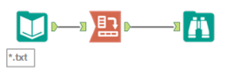
As you can see using the wildcard input of the resulting json file and a transpose was simple.

2016-11-13_20-08-31

Finally to combine with the google sheet (called “Extract” below) and the hexmap data (Sheet 1) in Tableau…..

2016-11-13_20-09-41

Not the most straightforward data extract I’ve done but I thought it was useful blogging about so others could see that extracting data from visualisation online is possible.

You can see the resulting visualisation my previous post.

Conclusion

No one taught me this method, and I have never been taught how to code. The techniques described here are simply the result of continuous curiosity and exploration of how interactive tables and visualisations are built.

I have used similar techniques in other places to extract data visualisations, but no two methods are the same, nor can a generic tutorial be written. Simply have curiosity and patience and explore everything.


Combining Multiple Hexmaps using Segments

After my #Data16 talk Chad Skelton challenged me to do a simple remake of the Guardian sunburst-type visualisation that I critiqued in my Sealed with a KISS talk (which you can now watch live at this link).

The original visualisation is show below:

2016-11-13_12-55-29.png

While initially engaging, I find this view complex to read and extracting any useful information involves several round trips to the legend. The circular format makes the visualisation appealing while sacrificing simple comprehension. Could I do better though?

Chad suggested small multiple maps and I agreed this might be the simplest approach but I was not happy with the resulting maps:

2016-11-13_18-22-51


Alaska and Hawaii why do you ruin my maps? The Data Duo have several solutions and my favourite is the tile map.

Thankfully Zen Master Matt Chambers has made Tile Maps very easy in this post and so I followed the instructions, joining the Excel file he provided onto my data and giving a much more visually appealing and informative result. The resulting visualisation is below (click for an interactive version):

cxjnfitxgae5mkn

However I still wasn’t satisfied with this visualisation, it has several problems:

  • it separates out the variables per state, meaning the viewer till has a lot of work to do to compare each states full rights.
  • it still requires the use of the legend to fully understand
  • the hover action reveals extra info meaning the users has to drag around to reveal the story
  • the legend is squashed due to space

How to solve these issues? I spent a while pondering it and eventually I found a possible answer: I could use a single map but split each hexagon into segments (ignoring marriage as it is allowed in all states – another solution woudl have been to cut out a dot in the middle for the seventh segment).

To do this I’d need to split up each Hexagon into segments, therefore I took out my drawing package and created six shapes:

These six shapes have transparent backgrounds and, importantly, when combined create a single hexagon.

Now with these shapes I can use a dimension (such as Group below) on shape, and then use colour to combine each hegaxon into different segment colours on the map (using Matt’s method and data for Hex positions).

2016-11-13_18-41-23.png

Using this technique I therefore created the visualisation below (click for interactive version):

2016-11-13_15-58-05

Using this method it would be possible to combine 3, 6, 9 or 12 (or possibly more) dimensions on a single map by segmenting the hexagons. Similarly using a circle in the middle would allow 4 or 7 dimensions.

I’m not sure how applicable this type of method is to other visualisations but please let me know if you use it as I’d love to see some more examples.

Scotch Anyone?

I have a passion for nice Scotch whisky, I haven’t tried lots but I try and get a new one every so often. A friend recently asked me for a recommendation and so I decided that, as my geekness knows no bounds, I’d build him a dynamic one rather than recommending something I like.

The resulting Tableau dashboard is below – click the image to access – any comments let me know here or on Twitter, what was your preference? My tipple over Christmas is currently a nice BenRiach 12 Year old.

scotch

Exploring Food Hygiene Ratings

I’ve been exploring open data sets recently and one that I came across was more interesting than most, perhaps it’s the number of takeaways I seem to eat! The Food Standards Agency in the UK publish their ratings for every establishment in the UK, and this data is available as an API or XML data set for anyone to download and analyse via their website. So I set about doing just that.

First problem, how to get the data into a usable format, I wanted to analyse the whole country so opted against the API and went for the XML data. The data is split by Local Authority with a separate link for each, so I took the following steps to download it (which I’ve done before with other sets of data).

1. Copy the source HTML with the links (only the relevant section)

2. Paste it into a Text Input tool in Alteryx

3. Use some formula to clean the data and then use a Download Tool to download each URL to a separate XML file (there were 396 files in total – this would have taken a long time by hand)

4. In a new module load in the XML as an XML file, using the root element and then parse out using XML parse tools to get the data required into a flat table format.

5. Clean the data and blend to geographic data source (eg. to attach common geographies spatially – I had the lat / lon) and output as Tableau Data Extract.

One of the biggest issues in the data in Step 5 to clean was miscoded Lat \ Lon values, to cure these I decided to find the average Lat / Lon of all the points in each Local Authority, then step through the data using a multirow formula and remove any rows that were suddenly much further away than the previous row. This is one of the biggest advantages of using Alteryx prior to the Tableau Data Visualisation – you can quickly spot and remedy errors that would be difficult to find and fix in Tableau.

Once in Tableau I then set about creating some visualisations users could use to explore the data. One question I wanted to explore was whether Food Hygiene was linked to Deprivation, so I downloaded the English Index of Multiple Deprivation (2010) and blended this in Tableau, by Lower Super Output Area, to the Food Ratings data. The data was too messy generally so I broke down by analysis by looking at splits by Government Office Regions and Business Type. I’m hoping the resulting Viz doesn’t look too crowded, this is my first Tableau Public Visualisation so please let me know your thoughts – constructive critique is very welcome.

Unfortunately WordPress won’t let me embed the Tableau Public code, so click on the image below to go to a separate view:

click for interactive view

click for interactive view

For my other dashboards (accessed via tabs in the above) I wanted to give users the ability to see a local map of their area, easily done using actions and lists, and finally a view of the Best and Worst Local Authorities as far as Hygiene Ratings go. This latter view was where I started to have problems with doing what I wanted.

Firstly I needed a table calculation to produce a weighted indication of which how good each Local Authority was. To do this I wanted to get the percentage of each rating across the LA and then multiply each one by the a reverse weighted Rating Value (i.e. 6 – Rating) to give lower rating more impact on the final score. I then wanted to sum these ratings.

Using table calculations in Tableau is still a learning exercise but now I understand addressing and partitioning then it’s a lot easier. The “window_sum” formula helped me calculate the percentage across the whole LA. So far so good.

However what I wanted to do was sort on the resulting table calculation, not as easy as it sounds as the sort is performed after the calculation in Tableau. Finally, by using the following steps I managed to do what I wanted:

1. Make the Table Calculation Discrete

2. Drag it to the Rows Partition

3. Set the appropriate “calculate using” values – use advanced is my recommendation.

4. Hide the headers to hide the value in the view.

To do the “Worst” sort order  I needed to calculate a reverse of the original calculation, then do the same again.

Finally when it came to restricting the view to the Top 10 then I was flummoxed, I tried using a Scaffold Dataset and blending with the original but to no avail – any tips welcome. In the end I was tempted to move the calculations to the Alteryx module I used before table to do some “pre” work, but I decided to leave the worksheet as it was. Any tips on achieving this in Tableau gratefully received.

Thanks for reading.